Trade Secrets – For How to Design Ceilings, The 5th Wall
/Poor old ceilings. They're so often neglected in the design of a room. There's no quicker way to take a space from "Oh, that's pretty" to "Wow!" than to add detail to the ceiling. After all, it is the 5th wall of any room!
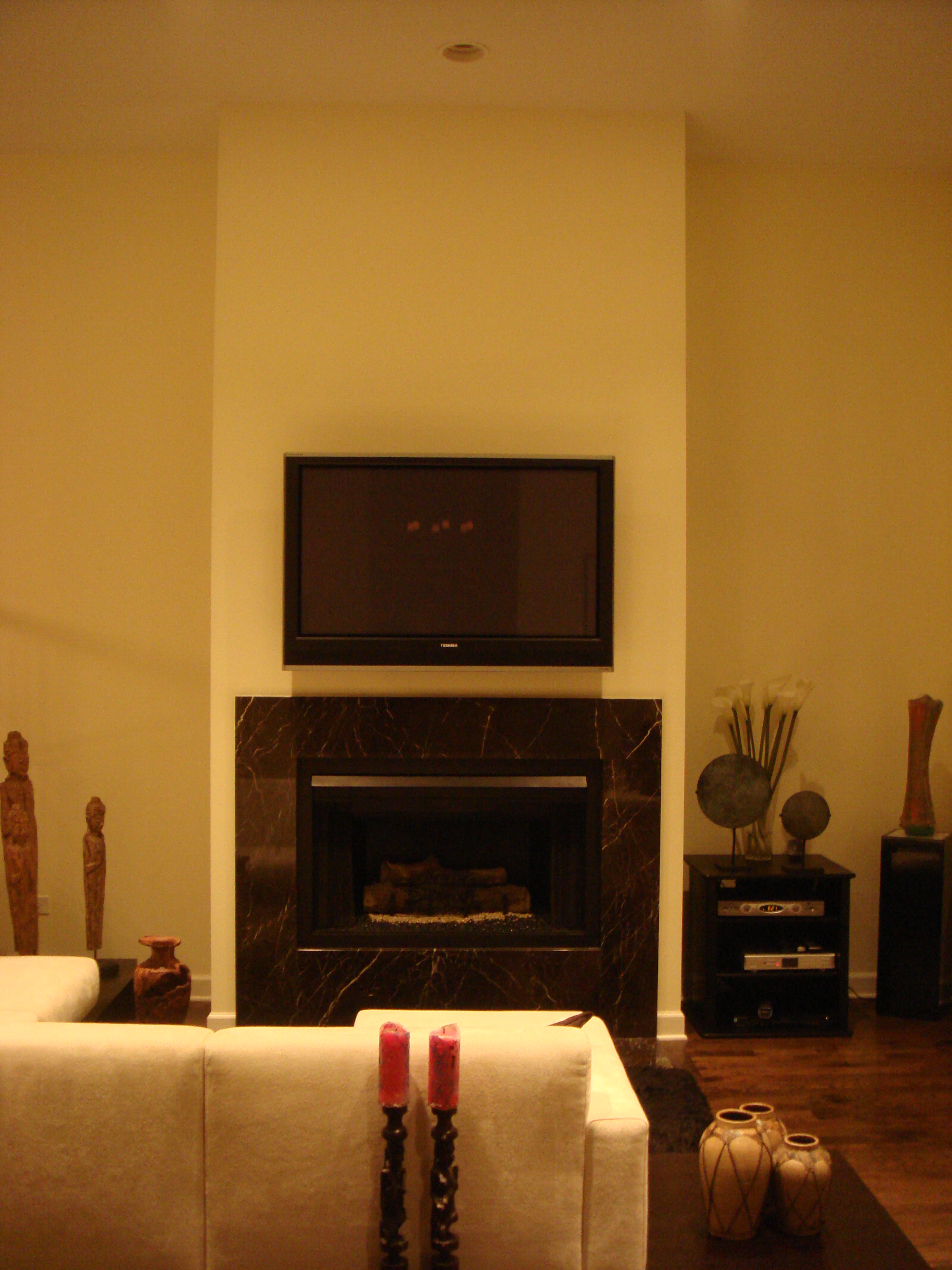
Let's take a trip back in time and look at some pics of this Chicago condo (whose powder room was featured on the blog last week) before we got our hands on it.
It's a great space... a big fireplace focal point, tall windows looking out onto the Chicago River, and thirteen foot ceilings.
Everyone loves high ceilings. It's open and airy and grand, no doubt there. But there are challenges when dealing with all that height. The large volume of empty space created by high ceilings can dwarf furnishings and just feel cavernous. Add to that the special challenges of this room...the small footprint which made that height feel out of balance, and the raised dining room and kitchen to the left, whose view of the river ran right through the vast emptiness above the living room, and we knew we needed to address the ceiling.
We began by building out a rectangular soffit, mirroring the shape of the room and defining the living area from the rest of the open plan first floor.
Already, it's looking better.
Since the goal was a warm, textured room full of art and artifacts and beautiful details, additional detail was needed to bring the ceiling up to snuff. Four beautiful wood panels were installed in the soffit with recessed lighting glowing softly behind and can lights around the perimeter for flexibility.
Now the rich wood draws the eye up and pulls the "5th wall" down, allowing it to become a part of the composed space. As Deb said, "We could've fill this room with treasures and you would never know. They'd be swallowed up."
Now the ceiling itself is a treasure.
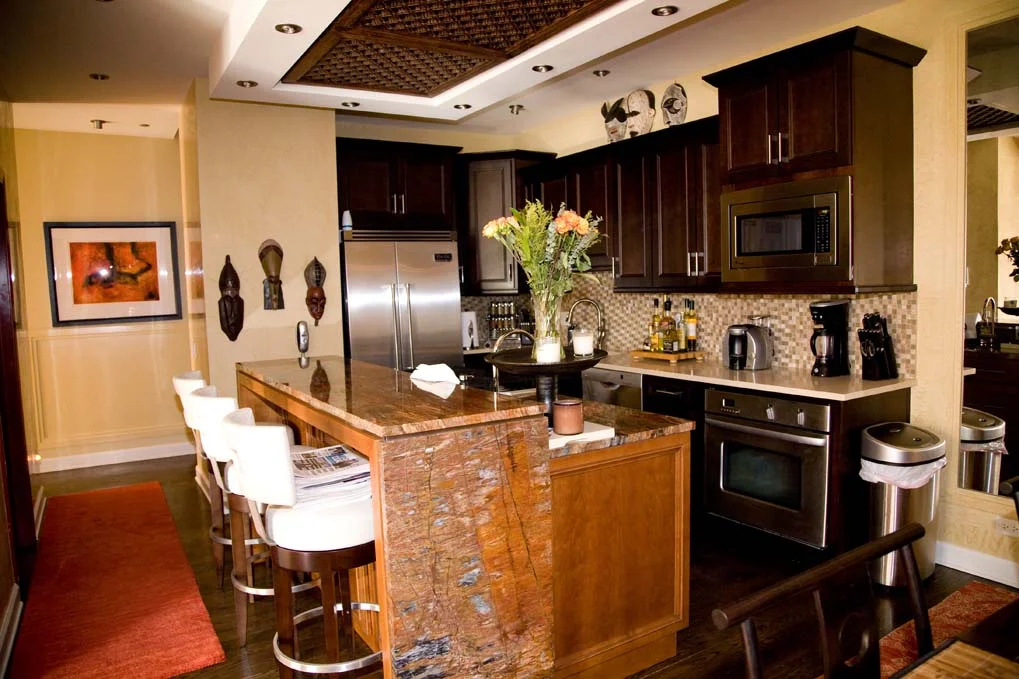
Let's peek into the kitchen of our luxury Chicago bachelor pad. We're focusing on the ceiling. We chose to replace the hood with an updraft (which can do the job just as well and, in this home of a bachelor with little interest in cooking, the 'gourmet kitchen' didn't fit with his lifestyle) surrounded by a soffit and inset lighting that shows off this beautiful antique carved panel.
Before
After
After
Just like a chandelier over a dining table, this panel grounds the space...The detail of this soffit with an antique screen- creates a more intimate feeling space, a special nook rather than just kitchen overflow.


